The ***** in the above title is based on the numerous centered designs that we come across.
There is User Centered Design - this is perhaps the most famous and widely used. You are supposed to be the designer who takes care of the user at all times. Considering what the user says is right and try to incorporate in the design.
The Human Centered Design - This is an offshoot of the above. Just that here we are replacing the user word with human. After all human sounds so much more caring. The personal touch here is much more just by using the human word.
The Technology Centered Design - This is something that is of prime importance in the engineering schools where there exist a design school. Examples could be MIT, IITG, etc. Here I feel the design revolves around the technology. This really gets exciting when we are looking at research labs and places where they are coming up with innovative use of technology for a better design. The iPhone, Microsoft Surface could be an example of starting of with this type of design, but later becoming a user centered one. After all they are looking at making things more intuitive for the user and more exciting.
Of late my research interests has been in studying the use of technology in emerging market, and rural population. This I feel is directly related to this centered design.
The Activity Centered Design - This is taken from the Activity Theory, and bases its premise on activities being performed in the course of a task. This is also promoted by Don Norman. The activity theory is a theory in Psychology, that emphasizes understanding who people are by understanding how they interact with the world. This has also been widely used by Bonnie Nardi from U C Irvine.
Then there this Goal-Centered Design. This is proposed b Alan Cooper and his team in the book About Face 3. I have become a fan of this of late. In trying to find the tasks that the users want to do, we often fail to recognize the goal behind the task. This process focuses on the design being three-tiered. The first is to identify the goal. The second the activities and then the third is the tasks. So for example, if i had to send mail to my friend, the goal is to communicate with my friend. The activities would be the finding a computer, looking up the site and opening it, and then the tasks would be typing the address, moving the mouse to the appropriate level, typing the mail and sending it.
Looking at a goal based approach, enables us to take care of the motivations and the intentions that users/ humans would have in order to use the appropriate technology to perform those tasks.
Sunday, March 30, 2008
Tuesday, March 25, 2008
User Experience Design and Research
I was preparing for an interview for internship and was brushing upon my theory on HCI and stuff.
Initially I was surprised to find that there were two separate positions in large companies, meaning companies where they invest a lot in User Experience and Usability. These two positions are that of a User Experience Researcher(UER) and User Experience Designer(UED). This set me thinking. What are the roles of a UER versus a UED. In the book About Face 3, Cooper and his team writes about an interesting thing. They mention how a designer need to be good at research. A few years ago this was not seen as very reasonable thing to do and hence we had the market researchers doing the research and passing on the findings to the designers. In most of the cases there would be a mismatch between what the users actually did, what the market researchers saw and what was reported and interpreted by the designers.
Taking this argument further, we find a UER's role to be extremely crucial in a project. They are supposed to be interacting closely with the UEDs. The UER is now a days supposed to give their input in a project at two phases of the software development life cycle. One is initially inoder to get a better understanding of the user's environments, the situations in which they are living and performing the tasks, the UER adopts methods like Ethnography, Contextual Inquiry and Fly-on-the wall Observations techniques, to get a better understanding. A noticable thing these days is the urgency in trying to capture the empathic needs of the user. This could be things like, I feel hot when I sit in the computer room, or something like, this just does not "feel" good. In the 3rd wave of HCI, this has been an area of research that is exciting. How do we collect and use the empathic inputs which result in a lot of qualitative data, into the design. How can the UED folks interpret and extract this information and use it as a valuable design input.
Once this is done, and the UEDs are set to work, the UER's role comes back when the product's prototypes are built. So then starts the other phase of the experience research. This does sound a lot like performing the Usability testing. But it is not likely so. The measure of experience needs to be defined based on the units of experience that the UERs would have defined initially.
A usability professional would more likely be dealing with only the final deliverable and whether it delivered on what it promised. They adopt a more quantitative approach to finding an answer to whether a design is successful. UERs on the other hands take into consideration the empathic issues equally.
In any user-centric design, the inputs of the UER at both these stages become really essential, and thats why companies that are clear on this differentiation of roles, have an edge.
Thursday, March 13, 2008
The Dying Art of Sketching
There were two incidences that inspired me to write this blog.
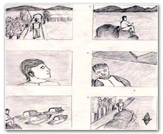
1) I was flipping through my sketchbook and to my surprise I found that around 80% of the pages in it was filled with text. This is good as it was a good compilation of my ideas and my thoughts while working on different projects. But on the other hand I find the absence of visuals and doodles and sketches. The number of sketches that I did for a project seemed to be very less. It was definitely less than the amount I had though, when I first bought the sketch book.
2) I got my copy of the ACM Interactions Magazine today and the cover article called Pencils before Pixels , by Prof Mark Baskinger from the CMU School of Design, set me thinking.
I realized a lot of things. It was alarming to me to a large extent. I realized how much of a
sad situation it was. The skill level of designers in sketching definitely seems to be on the downfall. It could be a reason, that Interaction design as a field attracts people from many fields, but that should not be an excuse to not sketch out the ideas before. This as Mark points out could be a reason why the industrial designers who enter the field of Interaction Design, are at such an advantage.
Being a designer is a lot about being to think visually. And being a photographer, it become all the more important to do so. I tend to think in pictures and images. I remember a time, when I used to sketch out a frame that I want to shoot, before actually going out and shooting. I guess the advent of the Digital Camera has been the reason.

I would also like to add here that diagrams on the other hand do not count as sketches. They can be at max an attempt to represent things visually. I have been doing this of late a lot. But they are just not as informative as a sketch.
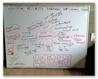
Over the years, progressing as a designer I have developed this interest in starting any discussion with a brainstorming session. We start from the centre and progressively branch outwards, depending on how the session progresses. This is been a great tool, but the point is that I tend to stop there.

The sketches still happen, but the number is less. And this definitely has had me in situations where the ideas stop coming. I have read lots about success stories where the idea of a business was thought about over lunch over a tissue. These ideas are furthered debated and thought upon and the birth of a success story takes place.
So, what do we do. A lot of this can be blamed to the carrying the computer with me phenomenon. I often feel paralysed when I do not have an access to a laptop for a couple of days. This as McCarthy and Wright in their book "Technology as Experience", discuss that we are becoming slaves to the machine. The fact that a rationalist approach to HCI, tends to inform us that whats there on the Photoshop, Powerpoint interface is the only way we can think. Its like the machine is guiding us in our thinking process.
Buxton in his book Sketching User Experiences deals with using sketching as a means to convey ideas, start discussions. This is a must read for all those getting or are in the field of Interaction Design.
To end, we all loved to draw, sketch when we were kids. Remember those dirty walls, and pages of the copy! What happens to us when we grow up? Perhaps its the feeling that I am no Michaelangelo, and hence I should not draw. Its important to understand that one does not need to be a great artist to convey ideas and thoughts. Its only with practice that we improve the level of sketching.
So, what are you waiting for! Grab that pencil and the sketchbook and revive the artist in you!
1) I was flipping through my sketchbook and to my surprise I found that around 80% of the pages in it was filled with text. This is good as it was a good compilation of my ideas and my thoughts while working on different projects. But on the other hand I find the absence of visuals and doodles and sketches. The number of sketches that I did for a project seemed to be very less. It was definitely less than the amount I had though, when I first bought the sketch book.
2) I got my copy of the ACM Interactions Magazine today and the cover article called Pencils before Pixels , by Prof Mark Baskinger from the CMU School of Design, set me thinking.
I realized a lot of things. It was alarming to me to a large extent. I realized how much of a
sad situation it was. The skill level of designers in sketching definitely seems to be on the downfall. It could be a reason, that Interaction design as a field attracts people from many fields, but that should not be an excuse to not sketch out the ideas before. This as Mark points out could be a reason why the industrial designers who enter the field of Interaction Design, are at such an advantage.
Being a designer is a lot about being to think visually. And being a photographer, it become all the more important to do so. I tend to think in pictures and images. I remember a time, when I used to sketch out a frame that I want to shoot, before actually going out and shooting. I guess the advent of the Digital Camera has been the reason.

I would also like to add here that diagrams on the other hand do not count as sketches. They can be at max an attempt to represent things visually. I have been doing this of late a lot. But they are just not as informative as a sketch.
Over the years, progressing as a designer I have developed this interest in starting any discussion with a brainstorming session. We start from the centre and progressively branch outwards, depending on how the session progresses. This is been a great tool, but the point is that I tend to stop there.

The sketches still happen, but the number is less. And this definitely has had me in situations where the ideas stop coming. I have read lots about success stories where the idea of a business was thought about over lunch over a tissue. These ideas are furthered debated and thought upon and the birth of a success story takes place.
So, what do we do. A lot of this can be blamed to the carrying the computer with me phenomenon. I often feel paralysed when I do not have an access to a laptop for a couple of days. This as McCarthy and Wright in their book "Technology as Experience", discuss that we are becoming slaves to the machine. The fact that a rationalist approach to HCI, tends to inform us that whats there on the Photoshop, Powerpoint interface is the only way we can think. Its like the machine is guiding us in our thinking process.
Buxton in his book Sketching User Experiences deals with using sketching as a means to convey ideas, start discussions. This is a must read for all those getting or are in the field of Interaction Design.
To end, we all loved to draw, sketch when we were kids. Remember those dirty walls, and pages of the copy! What happens to us when we grow up? Perhaps its the feeling that I am no Michaelangelo, and hence I should not draw. Its important to understand that one does not need to be a great artist to convey ideas and thoughts. Its only with practice that we improve the level of sketching.
So, what are you waiting for! Grab that pencil and the sketchbook and revive the artist in you!
Subscribe to:
Comments (Atom)
